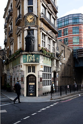
One of the photos from assignment three I discussed with my tutor was the one of Black Friars Pub. His comments were that it looked a bit wonky.
This is the image:
I agree it is wonky. I had tried to correct it using the distort filter in photoshop. I decided to have another look at it and see if I could do a better job. When I went back to the original file here:
Here is a less radical adjustment:
This is better but there is still something not quite right with this image.
I went through some of the other pictures I took that day and decided this one was better. This has been corrected slightly using the distort filter in photoshop:
I think this is a better picture.
What I have learnt from this is the benefit of going back to previous images. And why you shouldn't delete your rejects. You may discard them one day then go back and see them differently another day. I find when I am working on an assignment I get so focused on the ideas at that time that I stop seeing other ideas and concepts.
I had discarded this image in my previous selection because I didn't like the figure in the doorway. I thought it cluttered and distracting. I preferred the man stepping into the image. In concentrating on this aspect of the image I overlooked the more important factor of the wonky building.
Even though I realise that my perspective correction was over corrected and I had made more distortion rather than correcting the problem, the second image is actually better. By a slightly different composition, one that moved the edge of the building away from the edges of the frame when using a wide angle lens, the original has less distortion to correct.


No comments:
Post a Comment